• About

sarathings

~ my art, my family, my life, my stuff…

sarathings

Tag Archives: Tim Holtz

Things on Thursday (except it’s Friday…)

22 Friday Jun 2012

Posted by Sara in Classes, ScrapBook, Things on Thursday...

≈ Leave a comment

Tags

Dylusions Ink Sprays, Flickr, ICAD, Online Card Classes, Paperie, Ranger, Tim Holtz

… oh well, that’s just how it goes sometimes, right? 🙂

1. I just signed up for this. Love the idea of a cute finished sampler and for $10 it’s a steal! I believe this discounted price (regular cost is $20) expires today so jump on it if you want to join in!

2. Looking forward to this online class as well – Online Card Classes have the best instructors, videos, and samples so I know it’s going to be a good one!

3. I am still really, really loving Index Card A Day (ICAD). 21 days in and I’ve done a card everyday – no catchup needed….yet! I love just getting to play and try new things and I love the size of the canvas. If you haven’t played along you can start anytime, no pressure. And the Flickr group is full of inspiration and amazing cards. I have to say thanks to Tammy for all the work she does organizing this and keeping everyone motivated – she rocks!

P.S. You can see all my ICAD posts here and all my cards (and M’s cards) here.

4. Saw this quote on the Big Picture Classes homepage today and thought it was perfect for those friends of mine doing Project Life. Most of them are at the point of playing catchup and figuring out how to stay caught up during the summer. Here you go ladies! 😉

“The sooner you fall behind, the more time you’ll have to catch up.”   – Anonymous

5. Tim Holtz and Ranger just released the Summer Seasonal Distress Inks and I’m a happy camper! They are super bright and when you blend the Salty Ocean and Picked Raspberry together, they make the best purple ever! Check out my ICAD from yesterday to see…

6. I have another 2012 Yearlong Album Class this weekend and we’ll being doing the next two months. Here’s a sneak of July!

For the 20 ladies joining me, no extra supplies are needed but bring a snack! 🙂

7. I have a blog post going live on The Paperie website today; my pick are Dylusions Ink Sprays! Here’s a snippet of the finished LO you’ll see over there!

8. Having dinner and a fire with my dad tonight and there will be extra little kiddies for mine to play with – fun!

Have a great weekend!

S.

Share this:

  • Click to share on X (Opens in new window) X
  • Click to share on Facebook (Opens in new window) Facebook
  • Click to email a link to a friend (Opens in new window) Email
  • Click to share on Pinterest (Opens in new window) Pinterest
  • Click to share on LinkedIn (Opens in new window) LinkedIn
  • Click to print (Opens in new window) Print
  • Click to share on Tumblr (Opens in new window) Tumblr
  • Click to share on Reddit (Opens in new window) Reddit
  • Click to share on Pocket (Opens in new window) Pocket
Like Loading...

Index Card a Day – #13

14 Thursday Jun 2012

Posted by Sara in ICAD2

≈ 6 Comments

Tags

Ali Edwards, Distress Marker, Ranger, Technique Tuesday, The Crafter's Workshop, Tim Holtz

I taught a class on Distress Markers last night so when I got home and started to make my card, it only seemed natural to pull out the Distress Markers!

First, I scribbled a few reds and pinks on my craft mat and misted with water to make little puddles of colour. Then I dragged my card through the ink. I did a couple of layers like that but it was still pretty light due to the colours I was using so I misted the whole thing with Interference Red Perfect Pearls Mist..

I stamped some leaves in VersaMark and heat embossed in white. I then quickly and messily coloured in the leaves with two colours of green. I stamped the sentiment in Archival, knowing I would be misting again, and stamped a few hearts, then added some tissue tape.

It still needed something so I used my VersaMarker to colour the hearts and then dusted them with Plum Perfect Pearls and added a few details with my Stardust pen and Uniball White Signo Gel Pen. Finally, I misted the whole thing with Biscotti Perfect Pearls Mist and added Coarse Texture Gel over a script stencil.

It’s OK, not my fave but it’s another card under my belt! I do like how the stencil work turned out – I was impressed to get the detail with a coarse gel, and I like how the white pen highlighted the words. The Stardust pen adds a good sparkle too, though you can’t see that in the pics.

I’ll be back tomorrow with another card – and one from M too!

S.
Share this:

  • Click to share on X (Opens in new window) X
  • Click to share on Facebook (Opens in new window) Facebook
  • Click to email a link to a friend (Opens in new window) Email
  • Click to share on Pinterest (Opens in new window) Pinterest
  • Click to share on LinkedIn (Opens in new window) LinkedIn
  • Click to print (Opens in new window) Print
  • Click to share on Tumblr (Opens in new window) Tumblr
  • Click to share on Reddit (Opens in new window) Reddit
  • Click to share on Pocket (Opens in new window) Pocket
Like Loading...

Index Card a Day – #11 (part 2) & #12

13 Wednesday Jun 2012

Posted by Sara in ICAD2

≈ 6 Comments

Tags

Ali Edwards, Claudine Hellmuth Studio, Dylusions Ink Spray, Lego minifigure, Ranger, Stamper's Anonymous, Technique Tuesday, Tim Holtz

Because I was the hostess for Day 11 of Index Card A Day at Daisy Yellow, I made my card for that day early. So then I wanted to make another one…..and I did!

This one was all about playing with my paints. I blobbed on red, teal, and green, then used my palette knife to smear them around and scratch them up – you know, making texture! Once it dried I added a handwritten quote from Winnie the Pooh, who I guess would really be A.A. Milne! 🙂

M and G got new Lego minifigures and M cut up the paper that comes with them so I took one of the pieces to add. I wish I had seen the Lego Red Riding Hood in the cut up pile – she would have been perfect here!

Finally, I added some Pearl Metallic Paint to the edges and around the collage piece. Of course, my favourite part is the fun texture in the paint!

Yesterday was super busy and I didn’t get a chance to make a card until late at night but M got started early, wanting to make one with a Lego figure herself. She did her favourite trick of painted around the edges of the card, all the way to the middle, then she used Matte Glue n’ Seal to adhere the Lego man – one on front, one on back (I forgot to get a pic of the back – sorry!)

When I finally got a chance to do mine, I started with a layer of Distress Ink which I then flicked with water to get light splotches – love that trick! I layered a piece of paper towel, then covered the whole thing with Gloss Multimedium, making the ink waterproof. I tried a stencil technique with metallic paint but it was a bust so most of that came off but still left a shimmer behind. I also heat set everything at that point, since the card was pretty waterlogged, and overheat the paper towel so it would bubble a little.

Over all of that I stamped my Mixed Media stamps, a clock, and some Ali Edwards sentiments. A misted wood veneer camera to finish it off and I was done… or not! I had bright pink overspray on my craft sheet (criminal for that to go to waste!) so I wiped it up on the edges of the card – definitely done now!

I’m hoping to get my 12 on Twelve post up today but it will either be late, or tomorrow!

Remember, Distress Marker class at The Paperie tonight – it’s not to late to sign up and come for the fun!

S.

Share this:

  • Click to share on X (Opens in new window) X
  • Click to share on Facebook (Opens in new window) Facebook
  • Click to email a link to a friend (Opens in new window) Email
  • Click to share on Pinterest (Opens in new window) Pinterest
  • Click to share on LinkedIn (Opens in new window) LinkedIn
  • Click to print (Opens in new window) Print
  • Click to share on Tumblr (Opens in new window) Tumblr
  • Click to share on Reddit (Opens in new window) Reddit
  • Click to share on Pocket (Opens in new window) Pocket
Like Loading...

Index Card A Day – #7

08 Friday Jun 2012

Posted by Sara in ICAD2

≈ 4 Comments

Tags

Archival Ink, Distress Stain, ICAD, ICAD2, Index card, Lawn Fawn, Perfect Pearls Mist, Ranger, Stamper's Anonymous, The Crafter's Workshop, Tim Holtz

So, those of you who have been reading my blog know that lately I’ve been loving my my mom’s sewing machine. Earlier this week she came and took it away – to make curtains! Really, Mom, curtains? My paper crafting is soooooo much more important! 😉

Anyway, the day she came to make me cry borrow take back her sewing machine, I ran downstairs and did a quick stitch around an index card so I’d have one to play with – yesterday was the day!

I misted the card with water, rubbed Distress Stains over it, then misted with water again to make them blend even more. It’s a small miracle the card didn’t simply disintegrate under that much abuse. And I’m wasn’t finished with it yet!

I took mercy and dried the card after all that, then laid down a stencil and misted with Bronze Perfect Pearls Mist. Heat set again. I stamped the butterflies and words in Cobalt Archival Ink and the swirls (an old, old Fancy Pants set) in Coffee Archival Ink and called it done.

I love how the misting turned out – in some lights you see a small shimmer, in other lights you really see the bronze pattern. And Archival Ink is becoming a new love – I have an order placed for a bunch of new colours – yay!

I also like how the stitching turned out to be a textural component rather than a frame, as I initially intended – love when things turn out different but better than planned!

M spent most of yesterday with Nana (the sewing machine thief) baking brownies, playing with her new toys, and watching TV so an index card was pretty low on her list of priorities, we’ll see what today brings!

S.

Share this:

  • Click to share on X (Opens in new window) X
  • Click to share on Facebook (Opens in new window) Facebook
  • Click to email a link to a friend (Opens in new window) Email
  • Click to share on Pinterest (Opens in new window) Pinterest
  • Click to share on LinkedIn (Opens in new window) LinkedIn
  • Click to print (Opens in new window) Print
  • Click to share on Tumblr (Opens in new window) Tumblr
  • Click to share on Reddit (Opens in new window) Reddit
  • Click to share on Pocket (Opens in new window) Pocket
Like Loading...

Index Card A Day – #4

05 Tuesday Jun 2012

Posted by Sara in ICAD2, Uncategorized

≈ 4 Comments

Tags

Adirondack Color Wash, Christy Tomlinson, ICAD, ICAD2, Perfect Pearls Mist, Pink Paislee, Ranger, Stamper's Anonymous, Tim Holtz

This one turned out a little more interesting than I expected due to the Perfect Pearls Mist and how it reacted to the texture gel I used. The outcome was a pretty cool effect!

I first laid down a Christy Tomlinson SheArt stencil and spread Liquitex Coarse Texture Gel over it. Normally I’m too impatient to wait for it to dry and heat set it, which makes some neat effects, but this time I was busy during the day and so it had time to dry on its own.

Once dry, I did one quick spray with Adirondack Color Wash, misted with water to get it all to spread and blend, and then dried the card. I stamped a sentiment and *almost* called it boring, but done.

But I had to add some shimmer, just had to add something to give it a little more oomph. So I sprayed Blue Patina Perfect Pearls Mist, assuming I’d get a bit of blue shimmer over the whole thing and make it a little more fun.

Boy, was I wrong! For some reason, the texture gel resisted the mist, causing it all to pool in the spaces between and making them super blue and shimmery – awesome! I love the Blue Patina colour so was very happy to really see it stand out and it looks amazing with the purple mist!

Isn’t that the coolest? All in all, this turned out way better than first thought – I love unexpected outcomes!

Stop back tomorrow, I have two cards to share – one is a very special one! 🙂

S.

Share this:

  • Click to share on X (Opens in new window) X
  • Click to share on Facebook (Opens in new window) Facebook
  • Click to email a link to a friend (Opens in new window) Email
  • Click to share on Pinterest (Opens in new window) Pinterest
  • Click to share on LinkedIn (Opens in new window) LinkedIn
  • Click to print (Opens in new window) Print
  • Click to share on Tumblr (Opens in new window) Tumblr
  • Click to share on Reddit (Opens in new window) Reddit
  • Click to share on Pocket (Opens in new window) Pocket
Like Loading...

Tuesday Techniques – Stencils, Part 1

05 Tuesday Jun 2012

Posted by Sara in Tuesday Techniques

≈ 4 Comments

Tags

Christy Tomlinson, Distress Ink, Ink Blending Tool, Pink Paislee, Ranger, Stamper's Anonymous, Stencil, Studio Calico, Tim Holtz

I love stencils and masks! So much fun to play and experiment with and they are so versatile! You can make your own, or buy more permanent ones, and there’s definitely something for every style.

I’ve had people say to me that they don’t like messy, or getting messy, so stencils are just not their thing. Wrong, I say! You don’t like the whole messy, art journally, painting covered, inky fingers stuff? Let me show how to cleanly use a stencil! 🙂

First, let’s talk basics…

1. I will not cover everything about stencils. First, I am no pro and don’t know it all, and second, there’s unlimited uses for stencils so there’s no way I can even touch the surface.

2. The things I will show you are totally buildable. For example, you like 2 or three different techniques? Then use them all – at the same time! But they’re also buildable in that you can start with the basic technique and build your own spin on it.

3. Stencils are not always stencils, sometimes they’re masks. Not a big deal, most people know what you’re talking about but just so you know the difference and can trot out your knowledge at the next dinner party you go to, here it is:

  • A stencil has open space – think those block letter stencils from grade school.
  • A mask covers something up – think the block letter itself.
  • So, you could use the mask to cover some paper, colour around it, and then reveal an uncoloured image:
  • And then the stencil to trace a border around it to further define the edges:

4. One big complaint I hear it that the image someone wants turns out messy. Here’s the easy reason why it’s messy – your medium was too runny. Dry medium (eg. ink, chalk) gives a more detailed image than wet medium (eg. mist, paint). The wetter your medium, the less precise your image as leakage under the stencil will occur. Both are great results depending on the look you want.

So, let’s start our stencil techniques with the neat and tidy stuff – dry mediums. I don’t have chalk, so we won’t be using that but if you have it I’d love to see what you do with your stencils!

If I want a crisp image, I always use Distress Inks. For one, I love them – great colours and very blendable. For two, I have them all and they’re always right next to me – easy access makes for well used tools!

As I said earlier, you can also use chalk for great results, and wet mediums, if you use them dry. Does that sound completely contradictory? It makes sense, but I’ll cover “dry” paint, when we get to paint! Today, it’s all about ink, detailed images, and clean hands!

Just lay your stencil on your tag (or layout, or card, or whatever) and use an ink blending tool to rub on the ink. You can do this on clean background or one that you’ve already painted, inked, prepped, etc.

If you only want certain areas, use sticky notes or computer paper to mask off the areas you want left as is – remember, a mask covers things so it can protect the areas you don’t want inked!

You could also just swipe the ink pad over the stencil, but this may make less than perfect images since direct ink to paper is wetter, and it’s messier since more ink is left on the stencil. I prefer to use the Ink Blending Tool and keep my fingers out of it!

Once you’re finished inking, lift off your masks and stencil and reveal the magic!

Awesome, huh? The reveal is my favourite part! 🙂

Now, complete your tag (or layout, or card, or whatever) and pat your self on the back for a job well done and clean fingers!

I added some shimmer to this one, and a little wooden bluebird 🙂

Try it out, then leave me a link where I can see your projects – you know I love that part too!

Check back later tonight for ICAD #4!

S.

Share this:

  • Click to share on X (Opens in new window) X
  • Click to share on Facebook (Opens in new window) Facebook
  • Click to email a link to a friend (Opens in new window) Email
  • Click to share on Pinterest (Opens in new window) Pinterest
  • Click to share on LinkedIn (Opens in new window) LinkedIn
  • Click to print (Opens in new window) Print
  • Click to share on Tumblr (Opens in new window) Tumblr
  • Click to share on Reddit (Opens in new window) Reddit
  • Click to share on Pocket (Opens in new window) Pocket
Like Loading...

Something New…

30 Wednesday May 2012

Posted by Sara in Art Journal, Week in the Life 2012

≈ 13 Comments

Tags

Ali Edwards, Art Journal, Dyan Reaveley, Dylusion, Gesso, Julie Fei-Fan Balzer, Mixed media, Ranger, The Crafter's Workshop, Tim Holtz

I’m going to try my hand at Art Journaling. Not anything personal, like a daily, write your thoughts, dreams, wishes, type of art journal, just one where I get to play!

And I’m a lucky girl because I have two friends, Cathie and Tina, who are doing this with me (though they already art journal, I’m the newbie!) If we’re super lucky, we’ll actually get together once a month too!

Here are the things I have to begin my Play Art Journal:

1. A mixed media album and some watercolour paper:

The album had the most heinous cover ever so that got gessoed and moulding pasted over immediately. It already looks better! Love the dimension, can’t wait to see what happens when I get around to adding colour:

2. The Crafter’s Workshop Stencils:

These are the Dylusions by Dyan Reavely – I’ll get more of these for sure! I love the patterns, the size, and that they come with a border too!

And these ones are mostly Julie Fei-Fan Balzer. Great designs, I have new ones of these already on the way!

3. Paint, Stain, Mist:

These are super cheap watercolour paints and I have some big plans for them! Also, aren’t they pretty! 🙂

I have a bunch of Claudine Hellmuth’s Studio Paints, all the Adirondack ColorWash and Dylusions Ink Sprays, Distress Stains and Inks, and more. These are going to be fun!

4. Gesso, Moulding Pastes (my friend Marg gave me a couple to try out that are amazing!), and Multi Medium.

5. Stamps:

I think my faves are going to be the Tim Holtz and Dylusions from Stamper’s Anonymous, but I have some Ali Edwards ones that I know will make their way in too. And there are some Dylusions stamps with people that are going to have to be mine very soon!

6. I also have the basics – a water mister, paint brushes, Archival Ink (need more colours there too!).

To help me along my way, a few of us are doing ICAD through Daisy Yellow. This is where you make one Index Card A Day – it can be written on , or painted, or gessoed, or whatever you want. The point is to do one a day. I see this as a great place and media on which to experiment!

In the past, I have only done one thing that has mixed media stuff going on – at The Paperie Retreat in May, I had fun with my Week in the Life album:

front cover

back cover

Yes, I know I haven’t posted the album yet, that’s because it’s not quite done. Almost though, and I will post it then, promise!

Want to join in the fun? I’m planning to post my Art Journal stuff on Wednesdays, once I actually start and I’d love to see your stuff too! Even join me for ICAD, it’s easy and anyone can do it, even if you only want to doodle everyday!

See you all tomorrow, maybe with a colourful Art Journal cover in tow! 😉 And if anyone has some suggestions for this new adventure or links I should check out, please let me know!

S.

Share this:

  • Click to share on X (Opens in new window) X
  • Click to share on Facebook (Opens in new window) Facebook
  • Click to email a link to a friend (Opens in new window) Email
  • Click to share on Pinterest (Opens in new window) Pinterest
  • Click to share on LinkedIn (Opens in new window) LinkedIn
  • Click to print (Opens in new window) Print
  • Click to share on Tumblr (Opens in new window) Tumblr
  • Click to share on Reddit (Opens in new window) Reddit
  • Click to share on Pocket (Opens in new window) Pocket
Like Loading...

Tuesday Techniques – Dry Embossing: Faux Letterpress

22 Tuesday May 2012

Posted by Sara in Tuesday Techniques

≈ 2 Comments

Tags

Cuttlebug, Distress Ink, Hero Arts, Ranger, Sizzix, Stamper's Anonymous, Tim Holtz

One of my favourite ways to play with dry embossing is to do something called Faux Letterpress. All you need besides the regular supplies is ink!

supplies

Now, you all know my love of Distress Ink and how they are my go to ink for all things crafty, right? Well, I don’t normally use them for this technique… :0 I know, I know, it’s shocking but I do have my reasons!

Usually I will use an embossing folder for this that has a lot of white, or open, space and Distress Ink just doesn’t play nicely with that much area on a plastic folder. However, the Hero Arts Shadow Inks are a dye ink that are formulated to work well with stamps that require a large amount of coverage. They look a little splotchy a first but as they dry and soak into your paper they smooth out to a perfect finish. And they are awesome for Faux Letterpress!

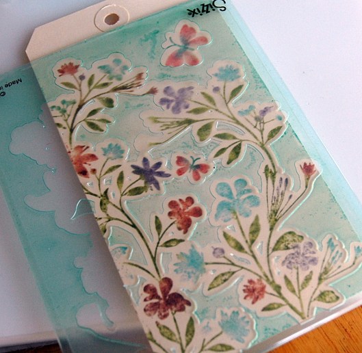
I also like the Hero Arts/Sizzix Stamp&Emboss line for this since you get a coordinating stamp and embossing folder.

First, ink up your stamp and stamp away! (I used markers and a mist of water to do my impression and make it look like watercolour.)

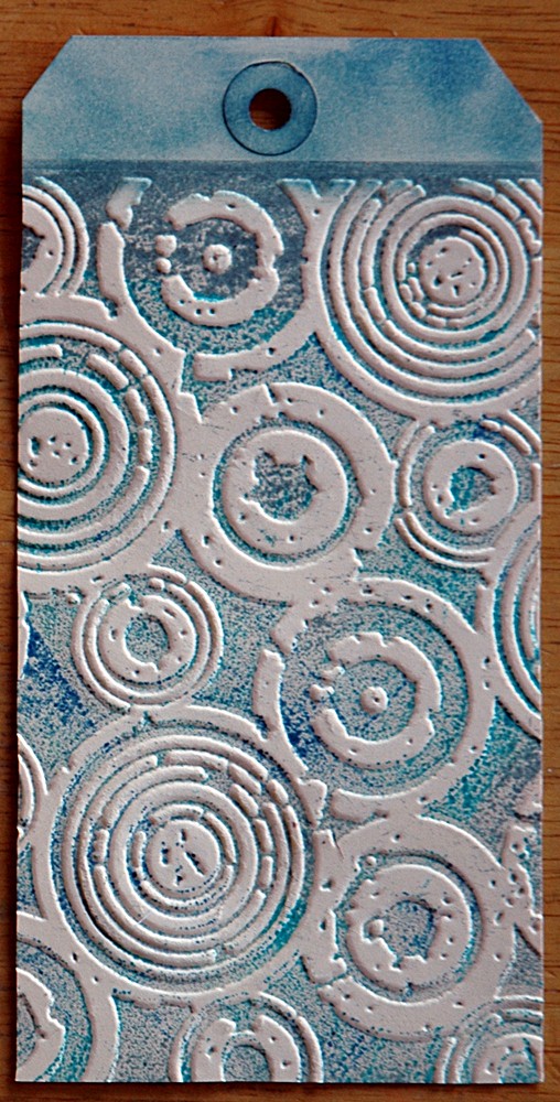
Then, you do the Faux Letterpress. Ink up the solid side of your embossing folder, the side that has the most raised area. Another reason the Shadow Inks work well with this is because they have a firm, felt ink pad so the ink doesn’t press into the recessed areas of your embossing folder like it would with a foam ink pad.

Now, place your stamped piece in the folder, carefully lining up the image, then run it through your machine. All the inked areas on the folder will be pressed into your surface while the raised areas remain uncoloured.

Here’s a more basic example:

I just inked up my folder, stamped an image over the inked area, then embossed. The fun thing here is that it looks as though the stamped image is under the embossed area!

Finally, I did one tag with Distress Ink so you could see the difference in the inks.

It turns out really splotchy but I do like the Distress Ink look here because I’m using a less open design and the design lends itself to a grungier feel anyway. This would be perfect on the front of one of those always hard to do male cards!

And, so you can compare easily, the three tags together:

I finished off my original  tag with some twine, a stamped and embossed mini tag, and some Tim Holtz doodads.

Hope you enjoyed! I’ll have one more tutorial on embossing next week and then I’ll have to rack my brains for something new! If you have seen anything or have questions about a certain technique, let me know – maybe I can take that on some Tuesday!

As always, leave me a link in the comments if you try this out – I’d love to see your creations too!

S.

Share this:

  • Click to share on X (Opens in new window) X
  • Click to share on Facebook (Opens in new window) Facebook
  • Click to email a link to a friend (Opens in new window) Email
  • Click to share on Pinterest (Opens in new window) Pinterest
  • Click to share on LinkedIn (Opens in new window) LinkedIn
  • Click to print (Opens in new window) Print
  • Click to share on Tumblr (Opens in new window) Tumblr
  • Click to share on Reddit (Opens in new window) Reddit
  • Click to share on Pocket (Opens in new window) Pocket
Like Loading...

Tuesday Techniques – Dry Embossing

08 Tuesday May 2012

Posted by Sara in ScrapBook, Tuesday Techniques

≈ 9 Comments

Tags

Distress Ink, Ranger, Texture Fades, Tim Holtz

Today’s technique is super simple but I will be expanding on it over the next couple of weeks. Let’s talk about dry embossing!

You will need:

Supplies

An embossing machine (I use a Cuttlebug), embossing folders, ink, and a blending tool.

First, put your tag or paper in the folder:

Before you ask, I cut a slit in the top of my folder so the tag would fit the way I wanted. Hey, Tim said it was ok so I’m going with it!

Second, run the tag and folder through your machine, using the sandwich specified in your user’s manual.

For the Cuttlebug you will need the A plate, B plate, embossing folder with paper, then another B plate.

And this is what you get on the other side!

Next, use your ink blending tool to add colour to the tag, concentrating on the embossed areas. As you can see below, the embossed pattern really stands out once you start layering colour:

Finally, finish up your tag and enjoy! I always make sure to add brown to the edges and blend colours for more definition and depth.

Pretty, hey? I think the embossing just adds another layer to the texture and interest of the tag.

Next week, I’ll show you some different materials that you can emboss!

Make sure you leave me a link if you try this out – I’d love to see what you make!

S.

Share this:

  • Click to share on X (Opens in new window) X
  • Click to share on Facebook (Opens in new window) Facebook
  • Click to email a link to a friend (Opens in new window) Email
  • Click to share on Pinterest (Opens in new window) Pinterest
  • Click to share on LinkedIn (Opens in new window) LinkedIn
  • Click to print (Opens in new window) Print
  • Click to share on Tumblr (Opens in new window) Tumblr
  • Click to share on Reddit (Opens in new window) Reddit
  • Click to share on Pocket (Opens in new window) Pocket
Like Loading...

Tuesday Techniques – Marbled Alcohol Inks

10 Tuesday Apr 2012

Posted by Sara in ScrapBook, Tuesday Techniques

≈ 33 Comments

Tags

Alcohol ink, Ali Edwards, Fragments, Ideology, Ranger, Technique Tuesday, techniques, Tim Holtz

I love me some alcohol inks! You really can’t mess them up because no matter what colours you pick to blend together, they all work – no muddiness or anything, they just play nice together! And if you don’t like what you get then add more or, on certain surfaces, wipe it all off and start over! I mean really, what’s not to like about that?

There are a bunch of techniques I love – using them on canvas, making plaid, removing parts with Archival Ink – but one of my favourite looks is marbled. This looks the coolest on fragments (you can also get charms), but works equally well on any transparent surface, like acetate or page protectors. For me, it’s just an embellishment as is, I don’t do anything more than make them and adhere them to my project, but you could also stamp sentiments and images over them to use as focal points.

Here’s what you need:

Supplies

Alcohol Ink, Fragments, Ink blending tool with felt, heat tool (optional).

First, just add a few colours to your felt. Simply put the tip of the ink applicator in the felt and give it a 2-3 second squeeze. If you don’t put the tip in the felt, well, let’s just say you could have alcohol ink permanently stuck all over the place. Of course, I don’t know this by experience, oh no, not me, I would never do something like that. I’ve just heard it could happen. *ahem*

Now, pounce your felt all over your fragment, twisting the ink blending tool as you go to mix and blend the colours. Don’t worry about what this layer looks like, we’ll be adding lots to it yet!

Because I’m impatient, I use a heat tool to speed up the drying process though it really isn’t necessary as they dry pretty quickly.

Next, add a little more intense colour to the felt, if you wish. I thought the first layer was pretty light and needed some depth so I added a darker colour. Then you pounce and dry again. I don’t add any more ink after this step since you want the felt to dry a little – as it dries and you add more layers, it gets “stickier” and builds the effect we’re going for.

Just keep pouncing and drying, pouncing and drying, until you get dark lines running through the colours on the fragment.

See? Marbled alcohol inks!

I like the fragments because of the thickness and translucency of the finished piece, but it does look cool on a page protector too, especially if you want to use said protector as a memorabilia pocket in an album.

Now, just add the fragment to your project and consider it done! Personally, I think they’re interesting and pretty enough to stand on their own, so I leave them alone.

This would be great hanging on a thank you gift, or birthday present…

You can see that I ended up using different colours for my finished tag – now I just have to find a spot to put the teal one I made!

As always, leave me a comment with a link to any projects you try using this technique – I’d love to see what you come up with!

S.

Share this:

  • Click to share on X (Opens in new window) X
  • Click to share on Facebook (Opens in new window) Facebook
  • Click to email a link to a friend (Opens in new window) Email
  • Click to share on Pinterest (Opens in new window) Pinterest
  • Click to share on LinkedIn (Opens in new window) LinkedIn
  • Click to print (Opens in new window) Print
  • Click to share on Tumblr (Opens in new window) Tumblr
  • Click to share on Reddit (Opens in new window) Reddit
  • Click to share on Pocket (Opens in new window) Pocket
Like Loading...
← Older posts
Newer posts →

This is me!

  • Sara's avatar Sara

RSS Feed RSS - Posts

Enter your email address to follow this blog and receive notifications of new posts by email.

Join 778 other subscribers
Simple Scrapper Design Team

Simple Scrapper Creative Team

  • Alexa Gill
  • Allie Trumpower
  • Amy Melniczenko – Team Leader
  • Ann Tamimi
  • Arielle Gordon
  • Cathy Caines
  • Christy Strickler
  • Crystal Livesay
  • Delanie Wood
  • Jamie Leija
  • Jan Sowder
  • Jen Conlon – Social Media Manager
  • Jennifer Johnson
  • Jennifer Wilson – Owner/Editor
  • Jenny Larson
  • Kathryn Quintana
  • Kelly Sroka
  • Kimberly Kalil
  • Lisa Corbin-Polak
  • Lisa Hausman
  • Melanie Ritchie – Graphic Designer
  • Neisha Sykes – Graphic Designer
  • Nicole LeBlanc
  • Sandy Henderson
Scrapbook Steals Design Team

Flickr Photos

i ami am wordsfunny things title
More Photos

Twitter Updates

Tweets by saracees
Follow Me on Pinterest pinterest-5ef5b.html

Categories

Ronda Palazzari Designs
Balzer Designs

Blogroll

  • Artist Wanna Be
  • Confessions of a Twenty Something Artist
  • Darrell Strickland
  • day jobs and the night life..
  • driven to ink
  • For The Love Of Art
  • Gone to the Dogs
  • Graham Case
  • Graham Case Photography
  • It's About Time…
  • pieces of my everyday life…
  • Sit, Scrap, and Relax
  • The Paperie
  • with Coffee in Hand
  • {Every Day}
Art Class Workshop
Balzer Designs Stencil 101
UberMedia Canvas Class
UberMedia Gesso

Archives

  • April 2016
  • February 2016
  • December 2015
  • November 2015
  • October 2015
  • July 2015
  • June 2015
  • May 2015
  • April 2015
  • March 2015
  • February 2015
  • January 2015
  • December 2014
  • November 2014
  • October 2014
  • September 2014
  • August 2014
  • July 2014
  • June 2014
  • May 2014
  • April 2014
  • March 2014
  • February 2014
  • January 2014
  • December 2013
  • November 2013
  • October 2013
  • September 2013
  • August 2013
  • July 2013
  • June 2013
  • May 2013
  • April 2013
  • March 2013
  • February 2013
  • January 2013
  • December 2012
  • November 2012
  • October 2012
  • September 2012
  • August 2012
  • July 2012
  • June 2012
  • May 2012
  • April 2012
  • March 2012
  • February 2012
  • January 2012

Blog at WordPress.com.

Privacy & Cookies: This site uses cookies. By continuing to use this website, you agree to their use.
To find out more, including how to control cookies, see here: Cookie Policy
  • Subscribe Subscribed
    • sarathings
    • Join 307 other subscribers
    • Already have a WordPress.com account? Log in now.
    • sarathings
    • Subscribe Subscribed
    • Sign up
    • Log in
    • Report this content
    • View site in Reader
    • Manage subscriptions
    • Collapse this bar
 

Loading Comments...
 

    %d