• About

sarathings

~ my art, my family, my life, my stuff…

sarathings

Tag Archives: Stencil

I saw the moon more clearly….

21 Thursday Mar 2013

Posted by Sara in Art Journal, Mixed Media

≈ 8 Comments

Tags

Art Journal, Dyan Reaveley, Dylusion Ink Sprays, Dylusions, Gesso, Mixed media, Ranger, stamping, Stencil, The Crafter's Workshop

I have to say, this art journal page didn’t turn out as I envisioned. Probably because it started out all wrong, and then got covered up, and then…… You know, everything snowballed and the end product was vastly different from what I had originally been going for.

However, I did get to play a lot and what’s not fun about that? 🙂

The original page had a lot of Dylusions Ink Sprays, which I love, but it just went all wrong. So I covered it all in gesso, played with the texture a bit – ran a fork through, that type of thing – and then let the gesso work its magic as it dried:

i saw the moon - gesso texture

And I ended up with the same colours I started with, just much more subtle and with  a lot more interest and texture.

I added some Viva Decor Ferro, which my kiddies say is like mud, so they love it, through a Dylusions Letter Jumble stencil:

i saw the moon - ferro

And I used a Pearl paint dabber sprayed with gold mist for the moon and quote:

i saw the moon - quote

I also stamped some of my favourite leaves, added some more mist through the Dotted Flowers stencil, and paper pieced some houses on vintage book paper.

All in all, I’ll live with it. After all, isn’t experimenting the main thing here? I also learned to put tape on my journal seams, as you can see from the colour that seeped through from a later page.

i saw the moon

Luckily, I don’t mind the extra pop of colour here but I won’t be taking that chance any more and am having fun now playing with different washi tapes. You’ll see some of that next week!

What have you done this week? Any fun things to link me up to and show me? You know I’d love to see it!

S.


Share this:

  • Click to share on Twitter (Opens in new window)
  • Click to share on Facebook (Opens in new window)
  • Click to email a link to a friend (Opens in new window)
  • Click to share on Pinterest (Opens in new window)
  • Click to share on LinkedIn (Opens in new window)
  • Click to print (Opens in new window)
  • Click to share on Tumblr (Opens in new window)
  • Click to share on Reddit (Opens in new window)
  • Click to share on Pocket (Opens in new window)

Like this:

Like Loading...

YLA2013 | Album Cover

19 Tuesday Mar 2013

Posted by Sara in Classes, Mixed Media, Techniques, Yearlong Album

≈ 10 Comments

Tags

Album cover, Luminarte, Mixed media, Ronda Palazzari, Silks, Stencil, The Crafter's Workshop, Yearlong Album, YLA2013

This may be one of my favourite projects ever. The colours, the texture, the dimension, the shine and, hello! That stencil.

album covers

Seriously people, that stencil may be my favourite of all time, maybe even edging out the Pomegranate one. Yes, it’s that good. It’s so good that I could even say I’m in love with Ronda Palazzari  for designing it and Jamie at The Crafter’s Workshop for making it. I love it so much that I made sure everyone in my Yearlong class got the 12×12 one as well.

Moving along, this lovely project also happens to be the album cover we are making for the Yearlong 2013 class. Obviously, as it is a mixed media album no one will have the exact same cover but I’ll be teaching all the techniques I used and showing how I got that awesome texture (hint: teabags may have been involved!).

album cover - tea bag texture

I also used modeling paste which made the hearts pop:

album cover - large heart album covers - small hearts

And gave fabulous dimension to the spine:

album cover - spine closeup

The paints I used were Luminarte Silks to give it that awesome shimmer and shine:

album cover - cheesecloth texture

And for those who don’t have Silks yet (I stress the word yet, they are a necessity!) I’m working on a way to use your regular acrylics and make them into a faux shimmer glaze. If it works, I’ll do a tutorial some Tuesday soon.

If you can’t already see the reason I love the Confetti stencil, here’s why:

album cover - shine

It’s like paint spatters, and blobs of molding paste, and quirky hearts all thrown together with great, but still imperfect, border to tie it all together.

And here’s a closeup of the front so you can really see how it all came together:

album cover - front

The back is very similar, but the paints blended a little differently. Plus, I still think I’m going to add a small camera stamp and my signature:

album cover - back

I had truly planned to do an album title and some decoration but I couldn’t bear to cover this up so… I guess we’ll have to go with Happy as an album title! 🙂

I’ll be back next week with the LO for this month, so look out for that later and keep an eye on Instagram (#YLA2013) for sneaks of it!

S.

Share this:

  • Click to share on Twitter (Opens in new window)
  • Click to share on Facebook (Opens in new window)
  • Click to email a link to a friend (Opens in new window)
  • Click to share on Pinterest (Opens in new window)
  • Click to share on LinkedIn (Opens in new window)
  • Click to print (Opens in new window)
  • Click to share on Tumblr (Opens in new window)
  • Click to share on Reddit (Opens in new window)
  • Click to share on Pocket (Opens in new window)

Like this:

Like Loading...

Tuesday Techniques – Stencils Part 2: Paint

12 Tuesday Jun 2012

Posted by Sara in Tuesday Techniques

≈ 5 Comments

Tags

Claudine Hellmuth Studio, Dylusions, Ranger, Stencil, The Crafter's Workshop

(EDIT: Our internet went wonky so this is super delayed today – sorry for the wait!)

Are you ready to play with paint? Today, I’m going to show you some of the effects you can get with paint and stencils.

Since paint is obviously more fluid than ink, the image you get will generally be less sharp and defined, but a little more dimensional. Depending on the style I want to achieve, I like both effects.

For the first sample I used Jenni Bowlin Paint Dabbers, though any acrylic paint dabber will work in a similar way. For the top of the tag, I kept the dabbers fairly dry, ie. I didn’t squeeze any paint out, and dabbed lightly over the surface of the stencil. For the bottom half, I squeezed out paint and dabbed it over the stencil, in the way you would normally use the paint dabber, laying down a thicker, more opaque layer.

As you can see, the dry technique gives a fairly good image even though we are using a wet medium, but the coverage isn’t as solid as it was when we used the Distress Ink. The bottom half has more even coverage but the paint seeps under the stencil and leaves a less defined edge. Also, you can feel and see the slight dimension of the paint, which is pretty neat!

The second sample still uses acrylic paint, but I moved to the Claudine Hellmuth Studio Line. These paints, my friends, they’re dreamy. So creamy and rich and the colours are yummy! Anyway… The top half is my favourite way to use paint and stencils – I just smear the paint over with a palette knife or craft scraper (or Pampered Chef scraper, whatever!).

For the middle I just used a paint brush and for the bottom, a cosmetic sponge.

The technique for the top part does allow seeping under the stencil, but it also gives a super defined and raised edge – very cool in real life but hard to show in a picture. The middle also has some dimension and, because you can better control how much paint is on the brush, it has less leakage. Finally, the cosmetic sponge is able to give a very defined and solid image or a gloopy, painty one – it depends on how wet or dry you make the sponge. For this sample I added a little paint, then dabbed it off on my craft mat until it was almost dry, then pounced it over the stencil until I was happy with the coverage. This is how you can do “dry” paint to get precise images.

The final sample uses watercolour paints. This happens to be my least favourite method, because I don’t get defined edges, or dimension, but it can be pretty cool as a background. Since watercolours require water, this is generally the most fluid of the paint techniques. Of course, you can make them creamier rather than runnier by using less water, but they also become less easy to use.

Myself, I like to do a wash of colour for building background layers so the seepage and undefined images are fine. In this sample, I used a heavier layer of colour than normal so you can see how they usually work with stencils. Mine are normally less precise than this as I use a runnier wash of colour.

My finished tag started with a background layer of Distress Ink, then the palette knife technique (my fave!) and the cosmetic sponge (fairly wet) technique. Some stamps, Perfect Pearls Mist, and tissue tape finished it off!

Have I mentioned how much I love the dimension and sharp edges the palette knife gives? Sweet!

All in all, you can have some great fun with paints and your stencils! There are also fluid watercolours, with a consistency more like acrylic, and oil paints, neither of with I used today. Go try some paints, steal them from your kiddies if you have to (the blue in the Crayola set is incredible!), and leave me a link so I can see what you’ve done!

Enjoy the rest of your day and go get painty!

S.

Share this:

  • Click to share on Twitter (Opens in new window)
  • Click to share on Facebook (Opens in new window)
  • Click to email a link to a friend (Opens in new window)
  • Click to share on Pinterest (Opens in new window)
  • Click to share on LinkedIn (Opens in new window)
  • Click to print (Opens in new window)
  • Click to share on Tumblr (Opens in new window)
  • Click to share on Reddit (Opens in new window)
  • Click to share on Pocket (Opens in new window)

Like this:

Like Loading...

Tuesday Techniques – Stencils, Part 1

05 Tuesday Jun 2012

Posted by Sara in Tuesday Techniques

≈ 4 Comments

Tags

Christy Tomlinson, Distress Ink, Ink Blending Tool, Pink Paislee, Ranger, Stamper's Anonymous, Stencil, Studio Calico, Tim Holtz

I love stencils and masks! So much fun to play and experiment with and they are so versatile! You can make your own, or buy more permanent ones, and there’s definitely something for every style.

I’ve had people say to me that they don’t like messy, or getting messy, so stencils are just not their thing. Wrong, I say! You don’t like the whole messy, art journally, painting covered, inky fingers stuff? Let me show how to cleanly use a stencil! 🙂

First, let’s talk basics…

1. I will not cover everything about stencils. First, I am no pro and don’t know it all, and second, there’s unlimited uses for stencils so there’s no way I can even touch the surface.

2. The things I will show you are totally buildable. For example, you like 2 or three different techniques? Then use them all – at the same time! But they’re also buildable in that you can start with the basic technique and build your own spin on it.

3. Stencils are not always stencils, sometimes they’re masks. Not a big deal, most people know what you’re talking about but just so you know the difference and can trot out your knowledge at the next dinner party you go to, here it is:

  • A stencil has open space – think those block letter stencils from grade school.
  • A mask covers something up – think the block letter itself.
  • So, you could use the mask to cover some paper, colour around it, and then reveal an uncoloured image:
  • And then the stencil to trace a border around it to further define the edges:

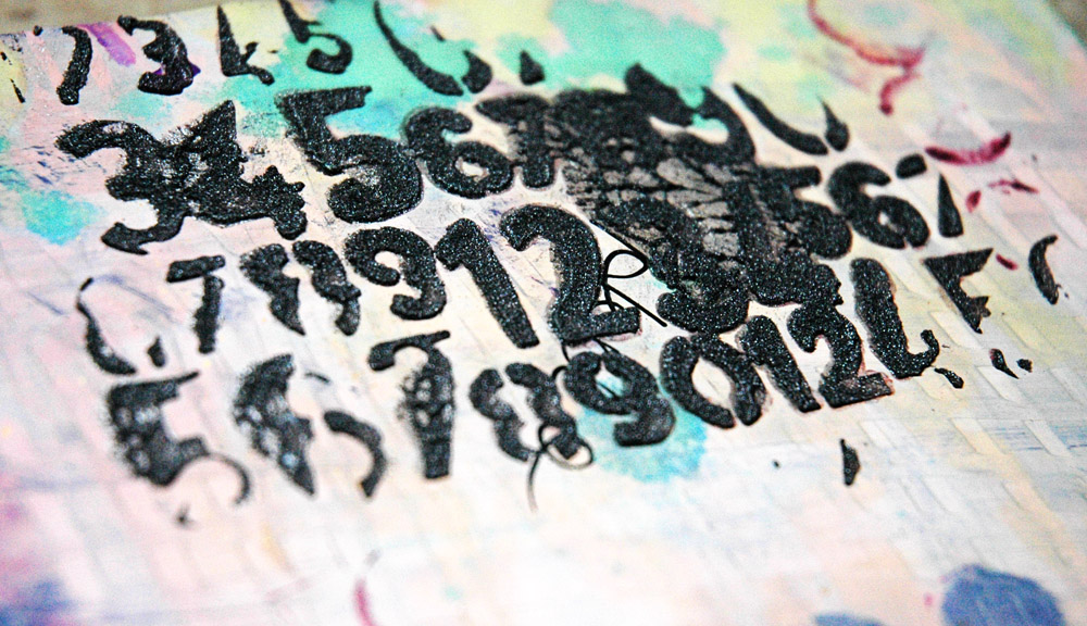
4. One big complaint I hear it that the image someone wants turns out messy. Here’s the easy reason why it’s messy – your medium was too runny. Dry medium (eg. ink, chalk) gives a more detailed image than wet medium (eg. mist, paint). The wetter your medium, the less precise your image as leakage under the stencil will occur. Both are great results depending on the look you want.

So, let’s start our stencil techniques with the neat and tidy stuff – dry mediums. I don’t have chalk, so we won’t be using that but if you have it I’d love to see what you do with your stencils!

If I want a crisp image, I always use Distress Inks. For one, I love them – great colours and very blendable. For two, I have them all and they’re always right next to me – easy access makes for well used tools!

As I said earlier, you can also use chalk for great results, and wet mediums, if you use them dry. Does that sound completely contradictory? It makes sense, but I’ll cover “dry” paint, when we get to paint! Today, it’s all about ink, detailed images, and clean hands!

Just lay your stencil on your tag (or layout, or card, or whatever) and use an ink blending tool to rub on the ink. You can do this on clean background or one that you’ve already painted, inked, prepped, etc.

If you only want certain areas, use sticky notes or computer paper to mask off the areas you want left as is – remember, a mask covers things so it can protect the areas you don’t want inked!

You could also just swipe the ink pad over the stencil, but this may make less than perfect images since direct ink to paper is wetter, and it’s messier since more ink is left on the stencil. I prefer to use the Ink Blending Tool and keep my fingers out of it!

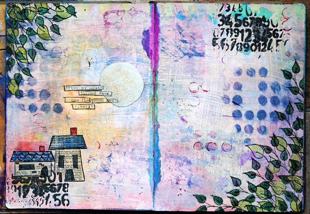
Once you’re finished inking, lift off your masks and stencil and reveal the magic!

Awesome, huh? The reveal is my favourite part! 🙂

Now, complete your tag (or layout, or card, or whatever) and pat your self on the back for a job well done and clean fingers!

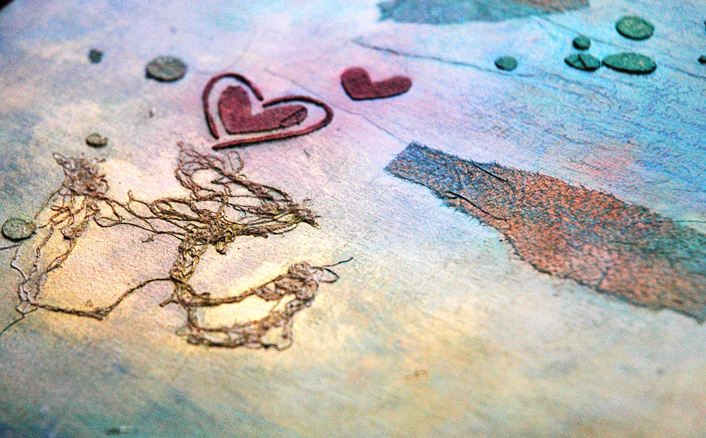
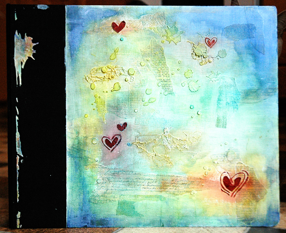
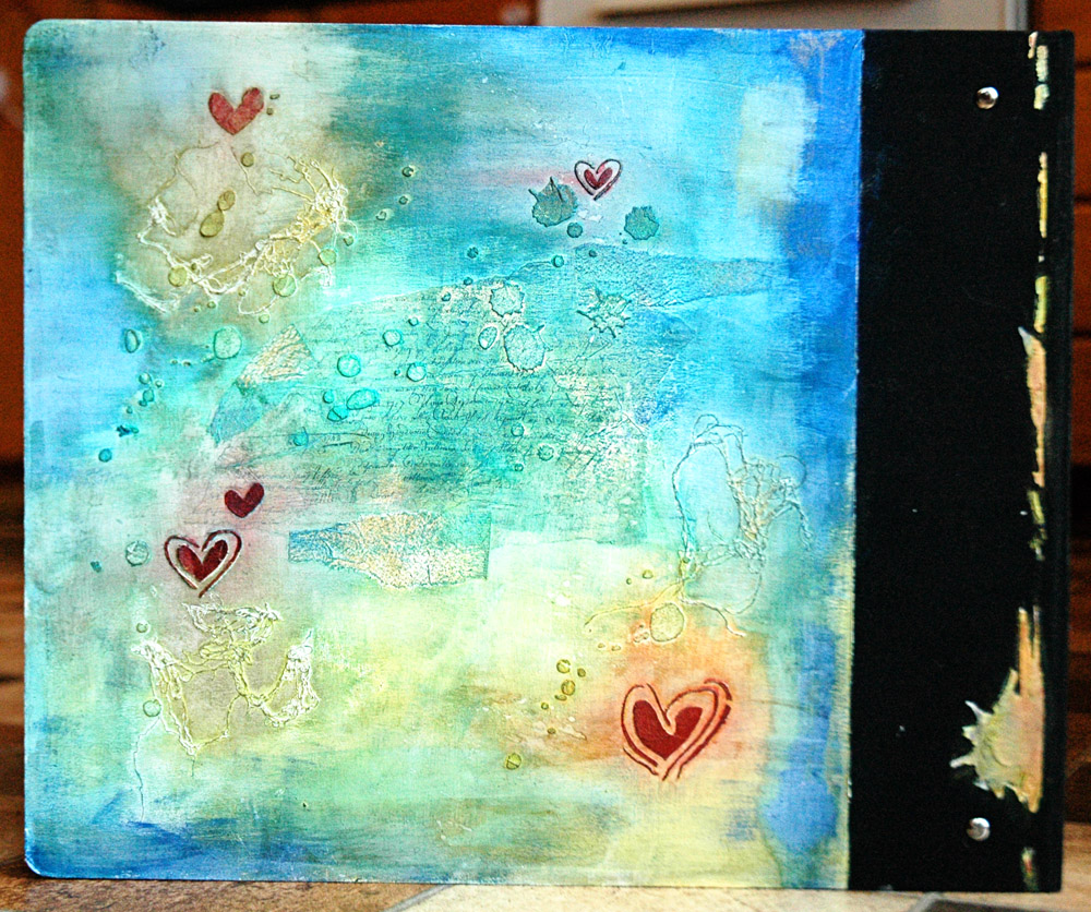
I added some shimmer to this one, and a little wooden bluebird 🙂

Try it out, then leave me a link where I can see your projects – you know I love that part too!

Check back later tonight for ICAD #4!

S.

Share this:

  • Click to share on Twitter (Opens in new window)
  • Click to share on Facebook (Opens in new window)
  • Click to email a link to a friend (Opens in new window)
  • Click to share on Pinterest (Opens in new window)
  • Click to share on LinkedIn (Opens in new window)
  • Click to print (Opens in new window)
  • Click to share on Tumblr (Opens in new window)
  • Click to share on Reddit (Opens in new window)
  • Click to share on Pocket (Opens in new window)

Like this:

Like Loading...

This is me!

  • Sara

RSS Feed RSS - Posts

Enter your email address to follow this blog and receive notifications of new posts by email.

Join 997 other subscribers
Simple Scrapper Design Team

Simple Scrapper Creative Team

  • Alexa Gill
  • Allie Trumpower
  • Amy Melniczenko – Team Leader
  • Ann Tamimi
  • Arielle Gordon
  • Cathy Caines
  • Christy Strickler
  • Crystal Livesay
  • Delanie Wood
  • Jamie Leija
  • Jan Sowder
  • Jen Conlon – Social Media Manager
  • Jennifer Johnson
  • Jennifer Wilson – Owner/Editor
  • Jenny Larson
  • Kathryn Quintana
  • Kelly Sroka
  • Kimberly Kalil
  • Lisa Corbin-Polak
  • Lisa Hausman
  • Melanie Ritchie – Graphic Designer
  • Neisha Sykes – Graphic Designer
  • Nicole LeBlanc
  • Sandy Henderson
Scrapbook Steals Design Team

Flickr Photos

i ami am wordsfunny things title
More Photos

Twitter Updates

  • @berncoad @VOCMNEWS @PeterCBC @NTVNewsNL @KellyAnneNTV @CMOH_NL Drives me crazy!The moderator should put a stop to it. 1 year ago
  • #mistergabe repping the rainbow all around today and stealing my @target #targetpride hoodie. #pride🌈❤️🧡💛💚💙💜 @ Moun… twitter.com/i/web/status/1… 3 years ago
  • Flowers from Evan. 😍 #awesomeevan #sarathings robertpmendoza @ Mount Pearl, Newfoundland and Labrador instagram.com/p/BzF9AVDh37d/… 3 years ago
Follow @saracees
Follow Me on Pinterest pinterest-5ef5b.html

Categories

Ronda Palazzari Designs
Balzer Designs

Blogroll

  • Artist Wanna Be
  • Confessions of a Twenty Something Artist
  • Darrell Strickland
  • day jobs and the night life..
  • driven to ink
  • For The Love Of Art
  • Gone to the Dogs
  • Graham Case
  • Graham Case Photography
  • It's About Time…
  • pieces of my everyday life…
  • Sit, Scrap, and Relax
  • The Paperie
  • with Coffee in Hand
  • {Every Day}
Art Class Workshop
Balzer Designs Stencil 101
UberMedia Canvas Class
UberMedia Gesso

Archives

  • April 2016
  • February 2016
  • December 2015
  • November 2015
  • October 2015
  • July 2015
  • June 2015
  • May 2015
  • April 2015
  • March 2015
  • February 2015
  • January 2015
  • December 2014
  • November 2014
  • October 2014
  • September 2014
  • August 2014
  • July 2014
  • June 2014
  • May 2014
  • April 2014
  • March 2014
  • February 2014
  • January 2014
  • December 2013
  • November 2013
  • October 2013
  • September 2013
  • August 2013
  • July 2013
  • June 2013
  • May 2013
  • April 2013
  • March 2013
  • February 2013
  • January 2013
  • December 2012
  • November 2012
  • October 2012
  • September 2012
  • August 2012
  • July 2012
  • June 2012
  • May 2012
  • April 2012
  • March 2012
  • February 2012
  • January 2012

Create a free website or blog at WordPress.com.

Privacy & Cookies: This site uses cookies. By continuing to use this website, you agree to their use.
To find out more, including how to control cookies, see here: Cookie Policy
  • Follow Following
    • sarathings
    • Join 317 other followers
    • Already have a WordPress.com account? Log in now.
    • sarathings
    • Customize
    • Follow Following
    • Sign up
    • Log in
    • Report this content
    • View site in Reader
    • Manage subscriptions
    • Collapse this bar
 

Loading Comments...
 

    %d bloggers like this: