• About

sarathings

~ my art, my family, my life, my stuff…

sarathings

Tag Archives: Tuesday Techniques

Tuesday Techniques and Tutorials – Embossed Edges, Tin Cans, and Dirty, Faded Ribbon

20 Tuesday Nov 2012

Posted by Sara in Tuesday Techniques, Tuesday Tutorials

≈ 7 Comments

Tags

Distress, heat embossing, Ranger, Tuesday Techniques, Tuesday Tutorials

Are you interested yet? 😉

I had the thought to put people in the car from Road Trip (thanks Krista, for that idea!) and wanted to use the phrase “Enjoy the journey.” And all of that led me to thinking this would make a great wedding card.

The only problem? I have no weddings coming up – nada. zip. zilch. So, I’m going to give it to one of you – hopefully someone else can make use of it! 🙂

If you want to make one of your own, here are the supplies:

Start by inking up a background stamp with Pumice Stone Distress Ink and stamp onto a manilla tag. Then use the ink blending tool with the same colour to ink the edges and soften the stamped image by blending over it.

Now, stamp some flourished with the same ink. Because we’ve blended and soften the background colour, the new stamped image will show up well.

Set this aside to dry – we’ll be doing some heat embossing later and we don’t want the powder to stick to the entire tag.

Ink up the car stamp with black Archival and stamp onto a spare manilla tag, then cut it out.

Using a craft knife and cutting mat, trim out the windows of the car, then use an ink blending tool to colour the edges with Gathered Twigs Distress Ink. If you want, use the Ranger Fine Detail Nib Water Brush to pull the ink from the edges into the centre of the car.

Now, use the Distress Markers in Broken China and Barn Door to colour two small wood veneer people (or whatever colours you want to go with the couple being hitched!). Add a little Glossy Accents and attach them to the back of the car, in the windows, with the coloured side facing out.

The next step is to make tin cans – what’s a wedding car without a little tacky happening? 🙂

Cut three narrow strips from the scrap manilla tag and ink them with Iced Spruce, Faded Jeans, and Aged Mahogany Distress Inks. Add a dot of Glossy Accents to the back on one end and add a piece of twine.

Wrap the paper around the twine until you get the size you want, then trim the end and adhere with Glossy Accents.

Use a piece of tape to stick the three “tin cans on strings” to the back of the car.

Set the car aside for later and get out the stamped tag.

I saw Tammy Tutterow do something similar on the edges of a tag she had on her blog and fell in love with it – now I’m addicted! Here’s how I do it, changed up a bit from Tammy’s:

Add embossing ink to the edges and cover with clear embossing powder.

As you can see, I wasn’t precise about it, it makes it look better this way.

Now flick the tag to knock off a lot of the powder and then heat set the rest. Use an ink blending tool with Gathered Twigs to ink over the embossed areas, then repeat the powder step again. Next, ink with a darker brown, like Walnut Stain. You should see light areas under the powder and dark areas in between where parts of the powder were licked off then inked over. It’s a neat, aged look and effect.

The darker you ink the top and the lighter you leave the base, the more interesting it looks. I left it pretty subtle for this tag but it was a bit more pronounced on last week’s.

You’re going to need ribbon to finish off the tag so run the Aged Mahogany ink pad over some Crinkle Ribbon, then spritz with water to blend. Crumple into a ball and dab with Gathered Twigs. Let dry or heat set – the two colours should give an aged and faded look to the ribbon.

Now, let’s put it all together! Add foam adhesive to the back of the car and adhere it to the left of the stamped and embossed tag. Get some word stickers and add them to the top right corner of the tag. Thread the ribbon through the hole in the tag. If you want, adhere the tag to a card and go party at a wedding!

I really love this tag and it makes me sad that I have no weddings that I can bring it to. So, leave me a comment and I’ll randomly pick someone to get it – if you’re lucky and have a wedding on the horizon, the card will already be done for you (and I will add it to a card before sending it off)!

Link me up if you try out the embossing technique, I’d love to see how it turns out for you!

S.

Share this:

  • Click to share on Twitter (Opens in new window)
  • Click to share on Facebook (Opens in new window)
  • Click to email a link to a friend (Opens in new window)
  • Click to share on Pinterest (Opens in new window)
  • Click to share on LinkedIn (Opens in new window)
  • Click to print (Opens in new window)
  • Click to share on Tumblr (Opens in new window)
  • Click to share on Reddit (Opens in new window)
  • Click to share on Pocket (Opens in new window)

Like this:

Like Loading...

Tuesday Techniques and Tutorials – Distress Marker Resist

23 Tuesday Oct 2012

Posted by Sara in Tuesday Techniques, Tuesday Tutorials

≈ 12 Comments

Tags

Distress Ink, Distress Markers, Ranger, Specialty Stamping Paper, Tuesday Techniques, Tuesday Tutorials

Finally, I’m back with another technique, and it’s one of my faves – Distress Marker Resist!

For this one you’ll need:

Supplies

Distress Markers, Specialty Stamping Paper, Distress Ink, an Ink Blending Tool with foam, and a stamp (I prefer rubber).

That’s it! Pretty limited and simple supplies but the specific items are a must. I have tried this out with Stampin’ Up! markers and found that it didn’t work as well, plus, the paper it a definite – this won’t work on other surfaces!

First, colour your stamp with your markers:

This is why I like the Distress Markers and a rubber stamp – I find the rubber holds the ink better, and the Distress Markers don’t become muddy or cross contaminated, even if I decide I want to go in with a light colour after already doing the dark colours.

You can mist before stamping, but for this technique I like a crisp impression so this is one of the rare times where I will stamp without misting it first.

Huff (blow hot breath) on your stamp and press your image directly on the Specialty Stamping Paper:

Allow the image to dry. This only takes a minute but you don’t want to smear the image so make sure it is dry, even hit it for a second with your heat tool if you like.

Can you believe how sharp the impression is with markers? Great definition!

Then, take your Ink Blending Tool and ink the entire surface with the Distress Ink of your choice. You could use any colour you like, but my favourites are Pumice Stone and Weathered Wood, though the browns are nice too – I like how the colour of the markers pop against the greys and browns:

Can you believe how the markers resist the ink? Like magic to me every time!

Now, mist water into the palm of your hand to make a puddle and then flick it on the surface:

Blot away the water drops and you instantly have a multilayered background without lots of time and fuss!

Looks pretty cool, hey?

Finish off your tag and stick it to a card and call it done! Mine hasn’t made it to the card yet, but the tag itself is finished:

If you have Distress Markers and want to learn more fun things to do with them, or are on the fence about buying them, check out Wendy’s demo at The Paperie retreat if you’re lucky enough to be going. She’s going to be showing a bunch of tips and techniques with them and she’s always got something fun I never thought about up her sleeve!

Let me know if you try this one out – you know I love to see what you make so leave me a comment and a link!

See you tomorrow!

S.
Share this:

  • Click to share on Twitter (Opens in new window)
  • Click to share on Facebook (Opens in new window)
  • Click to email a link to a friend (Opens in new window)
  • Click to share on Pinterest (Opens in new window)
  • Click to share on LinkedIn (Opens in new window)
  • Click to print (Opens in new window)
  • Click to share on Tumblr (Opens in new window)
  • Click to share on Reddit (Opens in new window)
  • Click to share on Pocket (Opens in new window)

Like this:

Like Loading...

Tuesday Techniques and Tutorials

18 Tuesday Sep 2012

Posted by Sara in Tuesday Techniques, Tuesday Tutorials

≈ 8 Comments

Tags

Amy Tangerine, Project Life, techniques, Tuesday Techniques, Tutorials, Twinkling H2O's

So, I’m back with the Tuesday Techniques after a summer hiatus but I’ve decided to change it up a little and have tutorials sometimes as well! Today is going to be a mini tutorial on my Project Life Album cover. Let’s hope it turns out because it’s the only one I have! 🙂

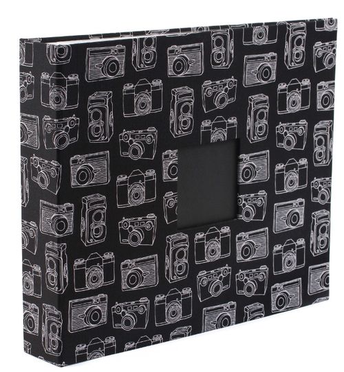
When I went to buy an album for Project Life, I had planned to get a really colourful leather one, but when I got to The Paperie, they had one more of these Amy Tangerine Sketchbook Camera Albums left:

To me, it looked like the perfect album for Project Life!

One small problem, I wanted some more colour – black and white is not normally my go to colour combination!

A little while ago I saw this post and video by Ronda Palazzari and I thought it was the perfect solution to my album cover! I didn’t use stencils, but I did decide to paint the cameras, some of them anyway.

I started by painting a few cameras with Titanium White Golden acrylic paint.

I wanted the colour to really pop so I needed a light layer beneath to cover the black, kind of like using primer on your walls.

It was a very thin coat and, as you can see…

…I wasn’t very particular about covering the whole area neatly. I only did three camera on each of the front and back covers and I liked the look so much that I was very tempted to leave it just like this!

However, I had it in my head that I wanted red cameras so once the white paint was dry, I broke out my favourite Twinkling H2O’s and used the Poppy colour to paint them in.

 Again, you can see that I wasn’t fussy about the neatness.

I like how the pops of red turned out, but I may add some more colour later. I’m still debating whether one colour is enough or not!

I’m planning to do a tutorial on how to make my one sheet, washi tape mini album next week. If there are any tutorials in particular you’d like to see, let me know!

S.


Share this:

  • Click to share on Twitter (Opens in new window)
  • Click to share on Facebook (Opens in new window)
  • Click to email a link to a friend (Opens in new window)
  • Click to share on Pinterest (Opens in new window)
  • Click to share on LinkedIn (Opens in new window)
  • Click to print (Opens in new window)
  • Click to share on Tumblr (Opens in new window)
  • Click to share on Reddit (Opens in new window)
  • Click to share on Pocket (Opens in new window)

Like this:

Like Loading...

Tuesday Techniques – Dylusions Ink Sprays

10 Tuesday Jul 2012

Posted by Sara in Tuesday Techniques

≈ 10 Comments

Tags

Dylusions Ink Spray, Ranger, Tuesday Techniques

Before I start I just want to say that this will be the last Tuesday Technique post this summer. The weather is beautiful, we’re always outside, and I simply don’t have the time to blog like I want to right now! Hope you all understand – things will get back to normal in the fall! We have so little great weather here that I feel the need to take full advantage while it’s nice!

Moving along…

You should all know my love of Dylusions Ink sprays by now, I do use them once in a while! 😉 So, I decided to do a quick little tutorial on how to use and layer them to build backgrounds. All you need are your Ink Sprays:

…and some water!

Dylusions work best for the techniques I’ll be showing you as they were made to react and play with water for neat effects.

First, pick your colours and randomly, but heavily, mist your surface:

I always mist with water and roll paper towel over it after the initial step. This will blend the colours a little more and take off the excess water while subduing the vibrancy a bit. Remember, we’re going for a background here, it needs to be a little more subtle!

The next step is to lay a stencil over the misted surface and spray with water.

Since the Ink Sprays react, the stencil creates a ghost like image to appear. Don’t worry if it doesn’t show up immediately when you try this, it takes a second for the water and ink to react and as the surface dries, the ghosted image becomes more pronounced.

Finally, after drying what’s been done so far, I spatter mist on top to get coloured droplets. All I do is remove the top of the bottle and shake the tube of ink over the surface – instant drops instead of mist!

I almost always finish my bright backgrounds with black stamped images – they stand out better and they make the colours pop. For the lighter images, I rub the ink pad over the stamp instead of properly inking up the stamp. You get a second generation look without having to stamp off first.

Hope you enjoyed this last tag of the summer and I hope you stick around for my erratic postings over the next month or so!

As always, please link me up to your projects – I’d love to see what you create!

S.

Share this:

  • Click to share on Twitter (Opens in new window)
  • Click to share on Facebook (Opens in new window)
  • Click to email a link to a friend (Opens in new window)
  • Click to share on Pinterest (Opens in new window)
  • Click to share on LinkedIn (Opens in new window)
  • Click to print (Opens in new window)
  • Click to share on Tumblr (Opens in new window)
  • Click to share on Reddit (Opens in new window)
  • Click to share on Pocket (Opens in new window)

Like this:

Like Loading...
Tuesday Techniques – Stencils Part 4: Modeling Pastes

27 Wednesday Jun 2012

Posted by Sara in Tuesday Techniques

≈ 41 Comments

Tags

Molding Paste, Stencils, Tuesday Techniques

We’re at the end of the stencil techniques and today is my favourite way to use stencils – with modeling pastes!

I love texture and dimension on my work, especially little pieces like tags. On a small surface, it’s hard to add lots of embellishments so extra texture adds interest without overwhelming the piece. Today, I’m going to show you some of the pastes and gels I use and the difference between letting them air dry or heat drying them.

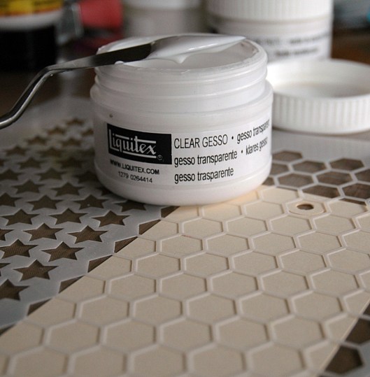
First, here are the supplies I’ll be using:

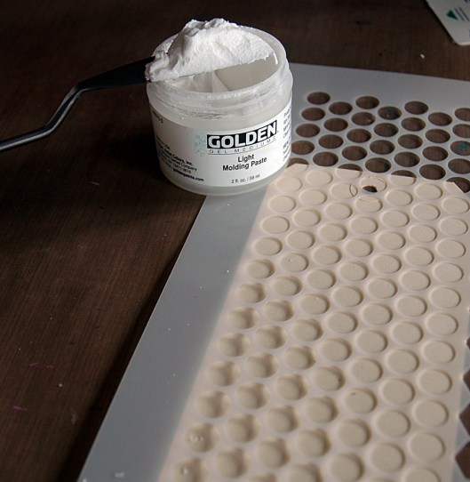
Either a stiff card (like an old bank card or hotel key), a palette knife, Light Molding Paste, Flexible Modeling Paste, Coarse Texture Gel, Coarse Pumice Gel, and Clear Gesso.

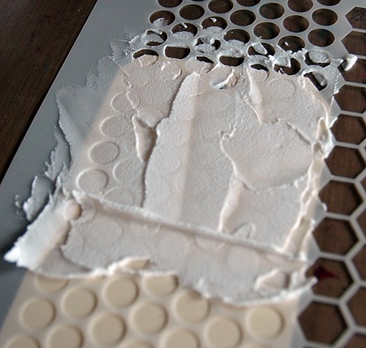
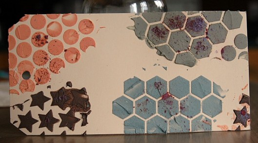
First take whichever medium you want to use and spread it over the stencil. I like to go heavier in some areas and lighter in others for extra texture but it looks great all flat too.

I chose to work with the pastes from lightest to heaviest so light molding paste is up first:

I heat set the left side and let the right dry on its own. You can see that the left is puffy and a more even looking layer:

The second paste I tried was flexible modeling paste:

I again heat set the left and allowed the right to air dry, and again, the left is puffier and smoother:

Next up was Coarse Texture Gel:

It was really hard to get a good picture of this one, but the left side, which was heat set, went translucent and although it puffed up during heating, flatten when it cooled. The air dried right side is more opaque in colour and less shiny:

Finally for the pastes, I used Coarse Pumice Gel which is so thick it’s almost not spreadable:

It’s very cool though, and the difference between heat setting and air drying was minimal. The heat set left side was slightly lighter in appearance:

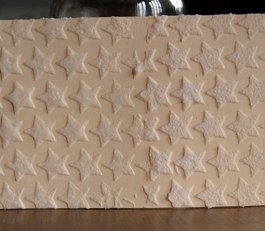
Finally, I used clear gesso, which is much runnier than black or white gesso, just to see what it did:

Once heat set, it puffed up but then, instead of falling flat, it fell down all wrinkly (kind of cool), while the air dried side was clear and rough:

Finally, I misted them all:

I found that the mist did soak into the air dried pastes more, whereas I noticed I could get more ink off the heat set side, almost like it was a resist. I didn’t do this with the Coarse Pumice Gel for two reasons: 1. It wasn’t dry, that stuff takes hours! and 2. I’ve tried it before and it always looks awful. I have been told that mixing colour in first works well though.

Speaking of mixing in colour, I’ve been trying to find a pigment to mix with pastes so they’re coloured without getting runny. Remember, the drier the better for stencils and clean designs! The best colour I had found so far was Golden Heavy Body Fluid Acrylics, and it was just ok for me, maybe I need more colours to experiment with. Today I tried my Perfect Pearls Powders – in a word, awesome!

All you have to do with any pigment is take some paste out and plop it on your craft sheet, then add (or sprinkle!) the pigment and use your palette knife or card to mix it up. Then smear it over the stencil like usual. My only complaint about the Perfect Pearls? Once mixed in they’re not shimmery! But the colours are great and because they’re a powder there’s nothing to liquify the paste.

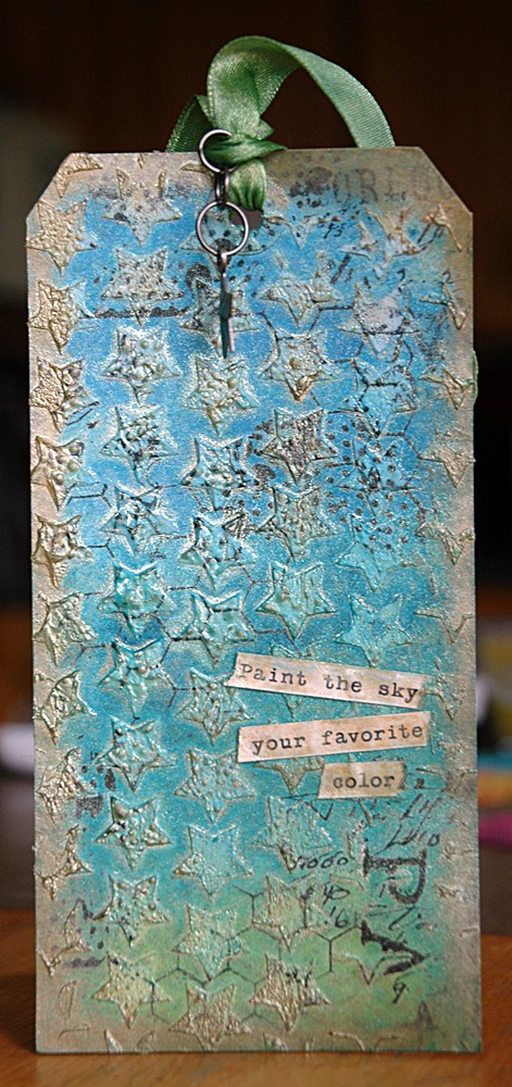
For my finished tag, I used Flexible Modeling Paste which I air dried almost completely, then heated to get fine little bubbles on the surface – more texture! 🙂

And see that quote? I had the card done, then found that on a sticker sheet – perfect!

Love the texture…

If you have any questions – let me know. If you try out modeling paste in a project, link me up in the comments – you know I love to see them!

S.

Share this:

  • Click to share on Twitter (Opens in new window)
  • Click to share on Facebook (Opens in new window)
  • Click to email a link to a friend (Opens in new window)
  • Click to share on Pinterest (Opens in new window)
  • Click to share on LinkedIn (Opens in new window)
  • Click to print (Opens in new window)
  • Click to share on Tumblr (Opens in new window)
  • Click to share on Reddit (Opens in new window)
  • Click to share on Pocket (Opens in new window)

Like this:

Like Loading...

Tuesday Techniques….

26 Tuesday Jun 2012

Posted by Sara in Techniques

≈ Leave a comment

Tags

Tuesday Techniques

….will be super late today – sorry! 😦

S.

Share this:

  • Click to share on Twitter (Opens in new window)
  • Click to share on Facebook (Opens in new window)
  • Click to email a link to a friend (Opens in new window)
  • Click to share on Pinterest (Opens in new window)
  • Click to share on LinkedIn (Opens in new window)
  • Click to print (Opens in new window)
  • Click to share on Tumblr (Opens in new window)
  • Click to share on Reddit (Opens in new window)
  • Click to share on Pocket (Opens in new window)

Like this:

Like Loading...

Tuesday Techniques – Stencils Part 3: Mist

19 Tuesday Jun 2012

Posted by Sara in Tuesday Techniques

≈ 2 Comments

Tags

Dylusions Ink Spray, Mist, Ranger, The Crafter's Workshop, Tuesday Techniques

We’ve done dry media (ink), wet media (paint), and so today we’ll do fluid media (mist).

As I mentioned in my first Stencil post, the drier the medium, the better the results if you want precise images. However, I also said that wet mediums can be used dry, like stippling with paint, for example. The same goes for mist, which is fluid.

You can mist your heart out:

And get this:

Now, to be honest, no one will ever mist that heavily and, chances are, they would roll paper towels over it first to soak up some of the excess before removing the stencil so it wouldn’t be this messy. I just wanted you to see how fluid the mist really is.

You can also spray some mist on your craft sheet, pick it up sparingly with a paintbrush, and get this:

Kind of a fun, arty look – not perfect but still quite defined.

Or you can go easy! Now I’ve been told that’s easier said than done so here are my tips and tricks to get a perfect misted stencil image every time. Keep in mind, it’s not wrong to mist your heart out if that’s they look you’re going for! If it’s not, read on!

First, do not, I repeat, do not press all gentle and nice on the mister. That will guarantee you splotches and puddles of ink. Not what we’re going for here! Just press down my friends, give it a good push and commit to the spray! I know I’ve mentioned this before….

Second, stand back; you don’t need to be on top of your project. Mist has a mind of it’s own and although you can say, “I want it round about there,” that’s as precise as it gets. It’s liquid and you’re spraying it, you have to be content with drifters. That being said, masking can beat the pants off fly away mist!

See? No mist will go where I don’t want it to be (like the top and bottom of the tag)!

Hold your mister about 12″ away and go for it. Don’t do it too much, two maybe three sprays are plenty, we’re trying to stay dry, remember? Carefully lift a corner of your mask and check, chances are you’re good to go – more ink comes down than you think.

This was two sprays, loads of colours and a few puddles – that’s why you don’t want too much.

My other no fail trick? Don’t spray on your project. No, seriously, it works! This is one of the only times I break out my misting box…

Set your paper inside, lay down your stencil, mask if needed, then aim your nozzle at the back of the box and go! Lots of ink will drift down over your project and give you a great image. This is fabulous with white mist on black paper – perfect snowy night!

Because this is an indirect method, it’s also the driest, but may require a few extra sprays. Always lift a corner and check, then mist again if you want.

See – a lot cleaner but the colour isn’t as intense.

One more thing – don’t waste all that mist on your stencil! Flip it over and press it onto another tag, or in an art journal, or on a 12×12 piece of cardstock for a LO background. Just use it!

You get the negative – sweet, huh?

Here’s my finished tag:

I misted three colours heavily (though not as heavily as the first example) and blotted the stencil before removing. I  wanted a defined but not perfect image and it worked!

I hope this makes you want to go play with mist a little – remember to leave me a link in the comments so I can check out your work when you give this a spin!

Next week – fun media with stencils! 🙂

S.

Share this:

  • Click to share on Twitter (Opens in new window)
  • Click to share on Facebook (Opens in new window)
  • Click to email a link to a friend (Opens in new window)
  • Click to share on Pinterest (Opens in new window)
  • Click to share on LinkedIn (Opens in new window)
  • Click to print (Opens in new window)
  • Click to share on Tumblr (Opens in new window)
  • Click to share on Reddit (Opens in new window)
  • Click to share on Pocket (Opens in new window)

Like this:

Like Loading...

This is me!

  • Sara

RSS Feed RSS - Posts

Enter your email address to follow this blog and receive notifications of new posts by email.

Join 997 other subscribers
Simple Scrapper Design Team

Simple Scrapper Creative Team

  • Alexa Gill
  • Allie Trumpower
  • Amy Melniczenko – Team Leader
  • Ann Tamimi
  • Arielle Gordon
  • Cathy Caines
  • Christy Strickler
  • Crystal Livesay
  • Delanie Wood
  • Jamie Leija
  • Jan Sowder
  • Jen Conlon – Social Media Manager
  • Jennifer Johnson
  • Jennifer Wilson – Owner/Editor
  • Jenny Larson
  • Kathryn Quintana
  • Kelly Sroka
  • Kimberly Kalil
  • Lisa Corbin-Polak
  • Lisa Hausman
  • Melanie Ritchie – Graphic Designer
  • Neisha Sykes – Graphic Designer
  • Nicole LeBlanc
  • Sandy Henderson
Scrapbook Steals Design Team

Flickr Photos

i ami am wordsfunny things title
More Photos

Twitter Updates

  • @berncoad @VOCMNEWS @PeterCBC @NTVNewsNL @KellyAnneNTV @CMOH_NL Drives me crazy!The moderator should put a stop to it. 1 year ago
  • #mistergabe repping the rainbow all around today and stealing my @target #targetpride hoodie. #pride🌈❤️🧡💛💚💙💜 @ Moun… twitter.com/i/web/status/1… 3 years ago
  • Flowers from Evan. 😍 #awesomeevan #sarathings robertpmendoza @ Mount Pearl, Newfoundland and Labrador instagram.com/p/BzF9AVDh37d/… 3 years ago
Follow @saracees
Follow Me on Pinterest pinterest-5ef5b.html

Categories

Ronda Palazzari Designs
Balzer Designs

Blogroll

  • Artist Wanna Be
  • Confessions of a Twenty Something Artist
  • Darrell Strickland
  • day jobs and the night life..
  • driven to ink
  • For The Love Of Art
  • Gone to the Dogs
  • Graham Case
  • Graham Case Photography
  • It's About Time…
  • pieces of my everyday life…
  • Sit, Scrap, and Relax
  • The Paperie
  • with Coffee in Hand
  • {Every Day}
Art Class Workshop
Balzer Designs Stencil 101
UberMedia Canvas Class
UberMedia Gesso

Archives

  • April 2016
  • February 2016
  • December 2015
  • November 2015
  • October 2015
  • July 2015
  • June 2015
  • May 2015
  • April 2015
  • March 2015
  • February 2015
  • January 2015
  • December 2014
  • November 2014
  • October 2014
  • September 2014
  • August 2014
  • July 2014
  • June 2014
  • May 2014
  • April 2014
  • March 2014
  • February 2014
  • January 2014
  • December 2013
  • November 2013
  • October 2013
  • September 2013
  • August 2013
  • July 2013
  • June 2013
  • May 2013
  • April 2013
  • March 2013
  • February 2013
  • January 2013
  • December 2012
  • November 2012
  • October 2012
  • September 2012
  • August 2012
  • July 2012
  • June 2012
  • May 2012
  • April 2012
  • March 2012
  • February 2012
  • January 2012

Create a free website or blog at WordPress.com.

Privacy & Cookies: This site uses cookies. By continuing to use this website, you agree to their use.
To find out more, including how to control cookies, see here: Cookie Policy
  • Follow Following
    • sarathings
    • Join 317 other followers
    • Already have a WordPress.com account? Log in now.
    • sarathings
    • Customize
    • Follow Following
    • Sign up
    • Log in
    • Report this content
    • View site in Reader
    • Manage subscriptions
    • Collapse this bar
 

Loading Comments...
 

    %d bloggers like this: