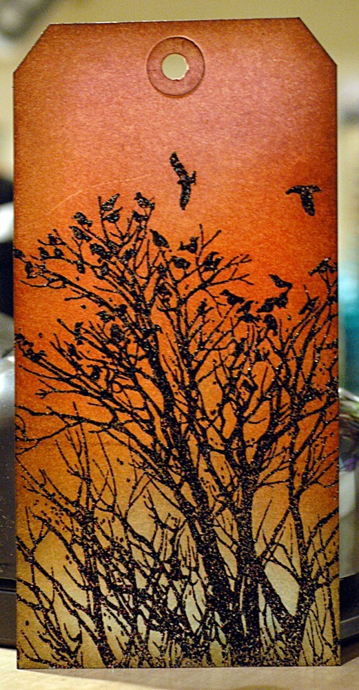
We’re going to continue with the Finishing Touches series today and look at inking the edges of a project and adding background stamping. Both of these things will add depth to your work and, in my experience, are usually that last thing you add and then go, “Aha! That’s what it needed!” Nothing major, it’s subtle but packs a punch!
Supplies are simple:
Brown ink for inking the edges (I like to use a darker one like Walnut Stain), and a different brown ink for the stamping (I like to use a lighter ink for this, usually Frayed Burlap or Brushed Corduroy); a background stamp (I use text or script 99% of the time); and an ink blending tool with foam.
That’s it – supplies most of you will have anyway (and if you don’t, run away now to the store and buy them please. Thank you. We can wait for you, these are essential supplies, after all!)
OK, now we can get started. Make your tag, or card, or embellishment, whatever. Here’s mine:
Pretty, right? The stamp is from Local King Rubber Stamps, a Canadian company (yay!) that makes cling rubber stamps and they have matching dies too! However, it’s still a little, well, boring.
So, ink the edges! This adds some definition without taking away or adding anything to the overall feel of the card.
See the difference? Just a little definition around the edges to help it stand out yet blend everything together.
It’s better, but still not quite there. With Distress Inks, I could flick some water on to blend the colour some more and add watermark splotches, but if you’re not using a background of Distress Ink, that won’t work for you. So, add some depth with adding bulk by stamping a large background stamp over the whole thing. I like the text and script stamps because they don’t distract from your focal point or image, but they still add a little something more. I use a lighter brown ink so it doesn’t overpower anything, you really just want this to be texture in the background.
Here’s my finished tag:
See what I mean? Same tag as before, but the edges are defined and the stamping adds some depth and interest without distracting from the silhouette stamp in the foreground. Not so boring anymore!
I did use Black Sparkle Embossing Powder which makes for a little more interest, as you can see here – love that stuff!
Hope you liked this one and that you try it out! As always, leave me link in the comments so I can see what you do with it!
I’ll be back tomorrow with my October Afternoon layout for the Dr. Seuss challenge, and I’ll fill you in on the class I’m taking tonight with Rae Lynn at The Paperie – she does amazing CAS stuff!
S.


